Saturday, 29 April 2017

Friday, 28 April 2017


Thursday, 27 April 2017

Tuesday, 11 April 2017
Film Review Feedback


Monday, 10 April 2017

Images For Horror Review

This image could be used because 3 of the main characters are in the shot. As well as this, the box and phone are in the photo which could engage the audience as they could wonder what the two objects have to do with the film. Furthermore, the camera shot itself is quite good as it makes the friends look powerful but they really aren't as the killer clown is the antagonist. So, it's almost a trick as it makes the audience think they will survive.

This image could be used because it is an image of the main antagonist. From my research an antagonist is usually on the image used. As well as this, it engages the audience as it is quite frightening.

This image could be used because it has the main antagonist and a main character in the image. Nobody knows what is going to happen therefore, it engages the audience. So, it would be a good image to use.

This image could be used because again the three characters are in the shot as well as an object of significance which is the balloon. Readers will notice this and realise something is linked with the balloon therefore, it will engage and interest them. However, it doesn't really catch the attention of readers.

This image could be used because it again involves the main antagonist but as well as this, an object of significance. It is a good image because it doesn't show the whole of the antagonist so it will peak the interest of the readers. However, it isn't as eye catching as the other images.


Film Reviews: What I Have Learnt
From researching film reviews and horror reviews I have found that:
Many include information like: director, cast, certificates and release date
As well as this, they include an interest curve, and a star rating.
Also, they include a main image which either relates to the antagonist or protagonist.
The written part is usually mostly positive or mostly negative. However, some may be both positive and negative. Furthermore, a brief overview of the plot is given.
I will apply what I have learnt to my review:
Main image will be of a main character within the movie.
Review will contain an overview of the plot and the positive and negative aspects of the movie.
I will include star ratings and information about director etc..
I may include an interest curve


Monday, 27 March 2017

Wednesday, 8 March 2017
Film Poster Feedback

Using snapchat I sent out my review to my selected audience. My target audience is 15-20 year olds. This age group was selected because they enjoy horror movies for the thrill and they were more likely to go to the cinemas and watch movies. I chose snapchat as the platform to contact them as it very popular amongst my audience. The feedback I received was nearly all positive and I was only told to make minor adjustments. Taking this into account I changed little things and uploaded the final draft.
Monday, 6 March 2017
Poster Second Draft

For the second draft I have made the text 'we only want to play' a different shade of grey as well as adding a blur to it by doing this I made it more mysterious. As well as this, I have removed the blood from the top of the 'P' in playtime which makes it easier to make out that the title is 'Playtime'. I did this because of my audience feedback as it allows me to get a better effect and engage viewers of the poster.
Changes Made:
Thursday, 2 February 2017
My Font

I went through many fonts and found that I didn't like any. So, went online to dafont.com
and found this font. I liked this because I realised it could be used for dripping blood & it has the effect I was looking for as it's a film about a clown I didn't want the font to be too serious I wanted it to represent a clown and to give the audience an insight of the film and events to come.


Here I chose the fonts that I liked and the shade of red that I liked.
In this video I came to the conclusion that this font looked the best and had to decide between the two colours. I chose the red as it makes the splatters look more like blood.
How I Achieved The Blood Effect
I decided to add blood to my poster because it is a horror film. Horror films usually involve killings which involve blood splatters. As my film is a slasher horror it definitely involved blood so I added it to the poster. Therefore, viewers would immediately know the genre and maybe even realise the sub genre.


The Image
When Editing my film I added a filter to the scenes to make them darker and give them more of a horror vibe as they were too bright and therefore, we wouldn't achieve the effect that we need for the audience to be frightened. Noticing this, I took a screenshot of two images from my film.
From my research I found that horror posters only give little or no insight onto the antagonist of the movie. So, I decided to the same as it engages the viewers of the posters as they want to know who and what is the antagonist. To do this I had to use two images of my clown and merge them together as well as adding many effects so that the audience can barely see the clown but can still make out that its something horrific in the mirror.


From my research I found that horror posters only give little or no insight onto the antagonist of the movie. So, I decided to the same as it engages the viewers of the posters as they want to know who and what is the antagonist. To do this I had to use two images of my clown and merge them together as well as adding many effects so that the audience can barely see the clown but can still make out that its something horrific in the mirror.

This was the tint I used on final cut pro x


Here are the two images
For the image of the box I used the magic wand tool on photoshop to remove the background.

I then placed the other image over it to get the clown inside the mirror. However, it didn't match with the background. So, I used the lighten effect on both images to get the final image.

My Background
For my background I used two images which were both downloadable. So, I had the correct permissions to use them. I chose many abstract images to get the effect I wanted. I wanted to achieve a horror effect which is obvious but to do this I wanted it to look gloomy, dull and with plenty of marks on the back. So, these images and photoshop allowed me to do this.


I manipulated these images using photoshop.
Link for steps: https://drive.google.com/open?id=0B0WjADipaKm_eWRxeUhLa1o4am8
Wednesday, 1 February 2017


Poster First Paper Draft
Before I could create my poster on Photoshop I decided to plan it out on paper as it would it make it easier for me to make knowing what I wanted to make. From my research I found that most horror posters would have a main image, title, credits and sometimes release date.
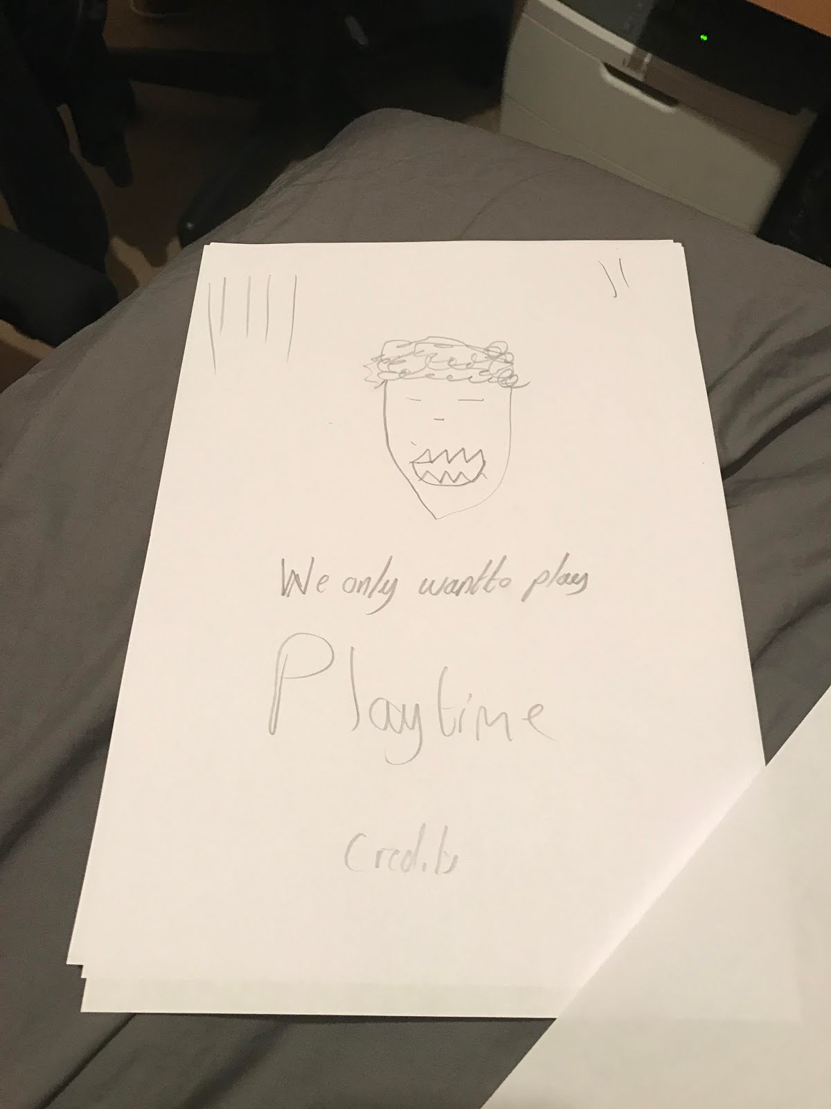
This poster would have the clown as the main image with the strap line 'We only want to play'
Furthermore, it would include blood splatters across the poster. As well as this, it would include credits and the film name 'Playtime'

This poster would have a main image of the music box(from the film) with the reflection of the clown within it (concealed). Also it would have 'Based on A true story' and the strapline 'we only want to play' on it. Furthermore, it would have credits and the title of the film 'Playtime'
Thursday, 12 January 2017
Similarities & Differences Between Horror Posters
From my research I found out that most horror posters consist of a title, dark background, strapline, information of who worked on the film and a main image. The main image will always give an insight into the film and are almost never shots taken from the film. As well as this it will always be
a mysterious image which will intrigue the viewer of the poster. For example: if the main antagonist is on the front cover there face will be obscured but will still give away enough to excite the viewer. The strap line is almost never a quote from the film it is often a statement made which links to the main image this is used to make the viewer ask themselves a question or to make them think and to get the answer they are looking for they will have to watch the film. Furthermore, it can give an insight into the plot too. So, it is used to persuade. In all of the posters I analysed the title was always beneath the main image which allows viewers to see the image first and if they are intrigued by it will look down to see the title name. Additionally, the people who worked on the film are always underneath the title too. This is used to persuade incase someone sees a name they know and are a fan of their work.
I found that not all posters require backgrounds as the poster of ‘The Amityville Horror’ the whole image was used for the cover. I thought this was quite a good feature to the poster as it still reveals the same amount of the film but has a more eye catching effect as viewers will be intrigued by everything on the poster and more horrific features are added. Therefore, persuading viewers to watch. Some of the posters have the director at the top of the posters, some have a strapline, some have based on a true story and sometimes it is left blank. However, in three of the posters something persuasive is always put at the top of the poster. Another difference I have found is that not all of the posters include release dates.


Similarities & Differences Between Movie Posters
By researching different genres I found that they all consist of a main image which give in an insight into the film and show the main characters within it. The title is always presented differently. For example: one the 'Point Break’ poster it is small and to the side but on the poster for ‘Petes Dragon’ it is in the bottom centre. Furthermore, all of the posters don’t have a background they all have a main image which takes up the whole poster. So, they don’t try to keep the film a mystery they want to give away quite a lot to persuade people to watch. Depending on the genre different colours will be used. For example: comedy and family films will have light warming colours as that is the effect those films are trying to get across and draw certain emotions from the audience. For example 'Petes Dragon' and 'Neighbors 2' have the same kind of colour scheme colours like blue are and white are used on both. Additionally, not all posters have the release date as this may not be important enough to fit on the poster.
Monday, 9 January 2017


Subscribe to:
Comments (Atom)