Thursday 2 February 2017

My Font


I went through many fonts and found that I didn't like any. So, went online to dafont.com
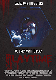
and found this font. I liked this because I realised it could be used for dripping blood & it has the effect I was looking for as it's a film about a clown I didn't want the font to be too serious I wanted it to represent a clown and to give the audience an insight of the film and events to come. 


Here I chose the fonts that I liked and the shade of red that I liked. 


In this video I came to the conclusion that this font looked the best and had to decide between the two colours. I chose the red as it makes the splatters look more like blood.

How I Achieved The Blood Effect

I decided to add blood to my poster because it is a horror film. Horror films usually involve killings which involve blood splatters. As my film is a slasher horror it definitely involved blood so I added it to the poster. Therefore, viewers would immediately know the genre and maybe even realise the sub genre. 


The Image

When Editing my film I added a filter to the scenes to make them darker and give them more of a horror vibe as they were too bright and therefore, we wouldn't achieve the effect that we need for the audience to be frightened. Noticing this, I took a screenshot of two images from my film.

From my research I found that horror posters only give little or no insight onto the antagonist of the movie. So, I decided to the same as it engages the viewers of the posters as they want to know who and what is the antagonist. To do this I had to use two images of my clown and merge them together as well as adding many effects so that the audience can barely see the clown but can still make out that its something horrific in the mirror.


This was the tint I used on final cut pro x 


Here are the two images


For the image of the box I used the magic wand tool on photoshop to remove the background.


I then placed the other image over it to get the clown inside the mirror. However, it didn't match with the background. So, I used the lighten effect on both images to get the final image.


My Background

For my background I used two images which were both downloadable. So, I had the correct permissions to use them. I chose many abstract images to get the effect I wanted. I wanted to achieve a horror effect which is obvious but to do this I wanted it to look gloomy, dull and with plenty of marks on the back. So, these images and photoshop allowed me to do this.


I manipulated these images using photoshop.


Link for steps: https://drive.google.com/open?id=0B0WjADipaKm_eWRxeUhLa1o4am8


Wednesday 1 February 2017

Poster First Draft

Poster First Paper Draft

Before I could create my poster on Photoshop I decided to plan it out on paper as it would it make it easier for me to make knowing what I wanted to make. From my research I found that most horror posters would have a main image, title, credits and sometimes release date.


This poster would have the clown as the main image with the strap line 'We only want to play' 
Furthermore, it would include blood splatters across the poster. As well as this, it would include credits and the film name 'Playtime'


This poster would have a main image of the music box(from the film) with the reflection of the clown within it (concealed). Also it would have 'Based on A true story' and the strapline 'we only want to play' on it. Furthermore, it would have credits and the title of the film 'Playtime'